Monday 25 February 2013

Precious Cargo


Mediums: Oil paints with scratch marks. Size: A3
In the topic which was set to include a 'person/place/object' I chose to look at vanity in my own perspective, since this was something I had not touched upon before. During the research of this topic I found that images within the magazine where simply over rated and had set many expectations that are above the normal standard with that of women today. At first, my initial intentions looked at the structure of a model's face and used the features such as the eyes, lips and nose as the main focus. I found that during this process, I was able to develop something more and use textures and text in the background to create a more diverse image. This is shown in my book development below. 

Idea Brainstorm (Preparation)


Initial Intentions


Exploring Media


Artist Influences


A Study of Skin Tones

(Oil Paints)


24 Images- combining both my photos and magazine editorial


 During the development stages, I composed a sketch of a 'model-is-tic' face that enhanced 'perfect features' in order to get the message of vanity across. However, I realized after researching in magazines that many of the articles included things such as 'how to look better' or 'a new style for a new you' - most of them about improving woman's looks rather than improving their self-esteem, so using this idea I  began to use text from the magazines in the background. This worked well as first but I felt it looked unrealistic. To develop this idea further I decided to use a fictional book as the background (on a random page, in this case page 24) of Alice in Wonderland. On this specific page Alice talks about Youth and how she would like to make herself taller. With this, I juxtaposed the idea of youth and painted a faint image of a woman using my own photography. I completed the image using Oil paints and scratch marks as shown in a close up to create texture and make the image seem as if its an illusion or even a fantasy.


My first Painting before development (A3)
Developed Image on Text (A3)


Close up: Scratches


Final Image (A3)


Sunday 24 February 2013

AS Level: Production Making

Pages (A3): Game boy model at exact scale.

During AS (A-Level), I was able to assemble a Game boy model as a project based on Advertising. In this subject (DT) we had to assemble the model to scale using real measurements and finally coating it with spray paint to make it seem almost exactly like the real packaging. This task gave me the ability to construct an object in 3D and to also follow the stages within a strict deadline. The making stages which is shown above in 3 separate sheets refer to the development processes which include using new materials to enhance the overall model.


 Apart from producing the Gameboy I also had to create a packaging net to place the Game boy in. This included using Adobe Photoshop and 2D Desktop. The packaging design was aimed at 12+ so I chose to look at a young theme in order to attract the younger generation. 

(Constructing a next generation speaker - Blue Sky Thinking)
 This task included using our own ideas to create a new and dynamic speaker for the next generation. We had no limit towards this challenge which meant we could create anything but it had to be realistic. I decided to go for a Bluetooth (wireless) speaker which luminated in the dark including other supposed techniques. I chose to create a simple design (inspired by the architecture of the Burj Al Arab in Dubai); as shown above and used Pro-Desktop to assemble my idea to life. I then also constructed this into a 3D model as shown below.


Saturday 23 February 2013

Legacy: Romanticized In Death

.
Medium: Ink + Acrylic + Tippex (105x55cm)
Music, history and art plays a huge part in my life so as part of my A-level fine art coursework I looked at the topic 'Legacy - Romanticized in death', and with that studied legendary musicians, actors, politicians etc. (who were mainly popular during the 50/60's era) following a surge of popularity after the their tragic deaths. John Lennon -inspired by his song 'Imagine'  allowed me to open up and experiment with new ideas while developing my artistic abilities. Listening to his songs, words of 'dreams' and 'skies' encouraged me to develop a universe or galaxy theme - far from the world we live in where there is - 'Nothing to kill or die for' and thus Space! This effect was created by using a wide range of ink hues, from black, pink, yellow and blue that have all combined well through the 'bleeding effect'.

Medium: Acrylic + Ink (105x55cm)

 Jimi Hendrix comes down as one of the most influential people of all time. And so as part of my topic 'Legend's - Romanticised in death' I looked at the fame and lifestyle that Hendrix had pursued before his tragic death at only the age of 27. Using research and many of his song lyrics as influence I came up with a pop art painting. I combined headlines from newspapers in the background which intended to create an illustration of his life; words such as "CAREER KILLS'' and "PEACE IN USA" in block and bold text almost makes it look as if its being shouted back out in contrast to his calm features which ultimately creates a fragile illusion of him. I used this image of Hendrix because not only is it among the popular photographs but because of his recognised military jacket. His song 'purple haze' encouraged me to colour in his afro in light purple ink which makes him seem as if he's fading away.


 Finding inspiration from traditional pop art techniques to compose a final structure for Marilyn Monroe. This is page allowed me to also look at different aspects within pop art and use combined colours to create a visual large-scale.
 

(50x90cm)


 Looking at Graffiti and incorporated an Abstract theme in the background to create an energetic piece which emphasise's Martin Luther King's popular speeches.

(30x16cm)

Just like John Lennon, and Jimi Hendrix, I took the chance to look at other legendary musicians that were romanticized in death and created an abstract theme which also juxtaposes lyrics from his songs to portray his life.

Experimental Work: Juxtaposing Cultural Masks


Using my own time outside of school I like to research cultural Art and in this piece I juxtaposed a Vietnamese mask with a traditional Arabic face - woman (dark eyebrows and dark eyes).  The overall effect of the combination is unusual however because I have a dual nationality myself it is interesting to see other combinations in terms of their country's traditional art being put together.
The mediums used in this piece are ink, black felt-tip and tippex.

A-Level Art: 'Adolescence'

During my final year at AS level, I studied 'Adolescence' in my topic for Unit 2. This allowed me to look at the rebellious ages which were portrayed mainly as portraits juxtaposed with multi-coloured hues in order to make the overall outcome of the pieces 'energetic' and 'lively'.

Medium: Oil paints and Conte (105x55cm)
(105x55cm)

This image is taken out of my Sketchbook where I began to experiment with hues and features on the face. Originally, the photograph shows a boy younger than his ages so I took inspiration from this to add a 'twinkle' effect in his eye to show the innocence within the rebellious teenagers.

(35x50cm)

(105x55cm)
As part of my topic 'Adolescence' I chose to look at the different moods of young adults and here I looked at the depression stage.

Skethbook pages: This shows development of going into symbolism and Colour

Visual Brainstorm of Ideas which also includes sketches and mini paintings. (Acrylic+Ink)

Exam Preparation Sketchbook Ideas - portraits

A-Level Art: 'Abuse'

Medium: Oil paints, Varnish and Conte
 This year, I have chosen to go for a topic within violence so that I could challenge myself further. So far it has become one of the most stimulating aspects of defining conceptual art. I looked into the contemporary meanings behind the abused victims and with it studied bruised and injured parts of the body. I felt that instead of painting images of injured faces/ body parts it would be more interesting to look at it from a different perspective and thus putting me out of my comfort zone. Eventually this led me to paint the structure of raw meat (image taken at a butchers) to convey a deep and 'grotesque' image that defines what being abused looks like. Since this is part of my coursework this year, it still needs adjustments and enhancements before it is fully completed. Jenny Saville has been my main source of influence while composing these pieces; I tried to study her impasto techniques while incorporating them into my own work in my own self expressive way. Throughout this topic my main use of media was Oil Paints however I did use a paintbrush for the majority of my work, instead I used a scraper in order to overlap and blend different hues together (creating different tones of red). In order to create drips (which is much harder to achieve with oil paints) I mixed varnish with red oil paint together, this then highlighted the drips and juxtaposed successfully with the scratch marks.

Medium: Oil Paints, Conte and Varnish (95x60cm)

Medium Used: Oil paints + Varnish (to create drips) (95x60cm)
 The Process from the beginning to end was recorded in my sketchbook as shown, I started with a brainstorm to get an idea of what I could go into or enhance. From this I then went onto looking at Artists as shown below, mainly centralized on Jenny Saville.


 Jenny Saville's techniques has been a great inspiration to me, I mainly experimented throughout my book and used different mediums however i focused on using Oil Paints and then incorporating scratch marks on top to create texture.

Medium: Acrylic, Conte, Oil Paints and Aluminum Background for texture
This page explores different mediums in terms of composing a final piece. Because each image focus's on different parts of the human body it allowed me to define different areas and not only focus on one. It shows mediums such as 'Acrylic+ Conte and Oil Paints'. This gave me a brief overview of what I could develop into in terms of media.

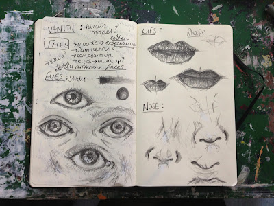
Skethbook: My initial idea was to look at moods of the abused victims.

Close up of varnish onto oil paint to show texture
Final Developed piece, this time using Prussian Blue (95x60cm)
As shown, I developed my pieces further during the process of my project as i began to study raw meat in depth and used more inspiration from other artists including Chaim Soutine and Francis Bacon. I also improved the painting by adding texture using varnish on top of the scratch marks and the thick paint as shown in the close up above. (The images taken are not very clear because they are still in the process of development and improvements as part of my Art Coursework.)


Sketchbook - Medium: Acrylic
 As part of development and Inspiration, I looked at the artist, Chrissy Angliker who although is not yet well known has a very dynamic and natural flow with her work which grabs my attention immediately. Her drips (which is a main theme throughout her paintings) have influenced me to show this in my own paintings - thus enhancing the drips on the raw meat.


Sketchbook: (Not Completed) Medium: Oil paints

The blue incorporated into my work has been influenced by artist Chaim Sountine as shown above. I Copied most of his work in order to get the idea of his techniques and then used this as inspiration to develop my work. Soutine has become one of my favourite artists amongst others due to his raw and expressive visual materials and images.