 |
| Mediums: Oil paints with scratch marks. Size: A3 | |
|
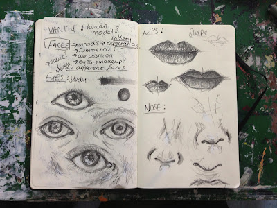
In the topic which was set to include a 'person/place/object' I chose to look at vanity in my own perspective, since this was something I had not touched upon before. During the research of this topic I found that images within the magazine where simply over rated and had set many expectations that are above the normal standard with that of women today. At first, my initial intentions looked at the structure of a model's face and used the features such as the eyes, lips and nose as the main focus. I found that during this process, I was able to develop something more and use textures and text in the background to create a more diverse image. This is shown in my book development below.
.jpg) |
| Idea Brainstorm (Preparation) |
.jpg) |
| Initial Intentions |
.jpg) |
| Exploring Media |
.jpg) |
| Artist Influences |
.jpg) |
| A Study of Skin Tones |
.jpg) |
| (Oil Paints) |
.jpg) |
| 24 Images- combining both my photos and magazine editorial |
During the development stages, I composed a sketch of a 'model-is-tic' face that enhanced 'perfect features' in order to get the message of vanity across. However, I realized after researching in magazines that many of the articles included things such as 'how to look better' or 'a new style for a new you' - most of them about improving woman's looks rather than improving their self-esteem, so using this idea I began to use text from the magazines in the background. This worked well as first but I felt it looked unrealistic. To develop this idea further I decided to use a fictional book as the background (on a random page, in this case page 24) of Alice in Wonderland. On this specific page Alice talks about Youth and how she would like to make herself taller. With this, I juxtaposed the idea of youth and painted a faint image of a woman using my own photography. I completed the image using Oil paints and scratch marks as shown in a close up to create texture and make the image seem as if its an illusion or even a fantasy.
.jpg) |
| My first Painting before development (A3) |
 |
| Developed Image on Text (A3) |
.jpg) |
| Close up: Scratches |
 |
| Final Image (A3) |

.jpg)
.jpg)
.jpg)
.jpg)
.jpg)
.jpg)
.jpg)
.jpg)

.jpg)


.jpg)
No comments:
Post a Comment